Thursday, 29 September 2016

Letterbox effect
For our music video we want to create a letterbox effect on our shots as we have seen this in many music videos and we felt that it made it look more professional, here are a few examples:
 < Arctic Monkeys - Why'd You Only Call Me When You're High?
 Arctic Monkeys - Suck It And See >
 < The Killers - When You Were Young


Tuesday, 27 September 2016


Monday, 26 September 2016
Song title overlay
David and I created a overlay for our music video displaying the title of the song and the band that it is by, the black background will be removed and placed over our shots at the start of the video. This is the video that we used to create the overlay using his tutorial:
This is the overlay that we created by using this tutorial:

This is the overlay that we created by using this tutorial:


Friday, 23 September 2016
Task K - Schedule

The picture will be better as I need to make it into a proper table and import it into my blog, however this is all the information going onto it.


Thursday, 22 September 2016

Monday, 19 September 2016

Friday, 16 September 2016


Task G - Draft of each ancillary text


Task F part one - Hand-drawn mock up of digipak

Thursday, 15 September 2016
Tuesday, 13 September 2016
Friday, 9 September 2016
Task D - Lyrics analysis
Oh - stop
With your feet on the air and your head on the ground
Try this trick and spin it, yeah
Your head will collapse
But there's nothing in it
And you'll ask yourself
Where is my mind? [3x]
Way out in the water
See it swimmin'
I was swimmin' in the Caribbean
Animals were hiding behind the rock
Except the little fish
But they told me, he swears
Tryin' to talk to me, koi, koy.
Where is my mind? [3x]
Way out in the water
See it swimmin'
With your feet on the air and your head on the ground
Try this trick and spin it, yeah
Your head will collapse
If there's nothing in it
And you'll ask yourself
Where is my mind? [3x]
Way out in the water
See it swimmin'
Oh
With your feet on the air and your head on the ground
Oh
Try this trick and spin it, yeah
Oh
Oh
This line is referring to the singer trying to find himself as he does not know where his head is at, his "mind" is another word for his head where the conflict between his mind and body. It could also be referring to the stress he may be under as the tone of the song makes him seem like he is stressed and under pressure.
This line can have a literal representation of the singer being upside down as his feet are in the air and his head is on the ground, which could refer to his life being tipped upside down due to the stress of trying to find himself. Another representation could be that he is feeling low and sad as his head is on the ground meaning that he is literally and metaphorically low.
These two lines could show that the singer is feeling empty inside as his head is empty due to losing his head/mind, it could also be inferred that he is feeling flat as it says that his head will collapse and therefore can show that he is very sad because "feeling flat" is a metaphor for feeling negative emotionally.
The fact that the singer says that the fishes are talking to him when he is in the Caribbean shows that he is not very sane, this could partly be because he is still trying to find his mind therefore he is having hallucinations about these animals talking to him.
With your feet on the air and your head on the ground
Try this trick and spin it, yeah
Your head will collapse
But there's nothing in it
And you'll ask yourself
Where is my mind? [3x]
Way out in the water
See it swimmin'
I was swimmin' in the Caribbean
Animals were hiding behind the rock
Except the little fish
But they told me, he swears
Tryin' to talk to me, koi, koy.
Where is my mind? [3x]
Way out in the water
See it swimmin'
With your feet on the air and your head on the ground
Try this trick and spin it, yeah
Your head will collapse
If there's nothing in it
And you'll ask yourself
Where is my mind? [3x]
Way out in the water
See it swimmin'
Oh
With your feet on the air and your head on the ground
Oh
Try this trick and spin it, yeah
Oh
Oh
This line is referring to the singer trying to find himself as he does not know where his head is at, his "mind" is another word for his head where the conflict between his mind and body. It could also be referring to the stress he may be under as the tone of the song makes him seem like he is stressed and under pressure.
This line can have a literal representation of the singer being upside down as his feet are in the air and his head is on the ground, which could refer to his life being tipped upside down due to the stress of trying to find himself. Another representation could be that he is feeling low and sad as his head is on the ground meaning that he is literally and metaphorically low.
These two lines could show that the singer is feeling empty inside as his head is empty due to losing his head/mind, it could also be inferred that he is feeling flat as it says that his head will collapse and therefore can show that he is very sad because "feeling flat" is a metaphor for feeling negative emotionally.
The fact that the singer says that the fishes are talking to him when he is in the Caribbean shows that he is not very sane, this could partly be because he is still trying to find his mind therefore he is having hallucinations about these animals talking to him.
Thursday, 8 September 2016
Task B - Letter of permission from the manager

Tuesday, 19 July 2016
Task 12 - Target Audience for Indie Rock (secondary)
Below is an embeded piece from https://infogr.am/Target-audience-research-analysis, here the relevant information that I need for my research is that the main target audience is around 16-25 years old students from the London area and dominated by white males at 68%.
Final Task practise plot lines
David and I brainstormed a plot idea that we were happy with for our final task and we wrote it down chronologically, then we are going to put it in our future questionnaire and allow the audience to chose which they like the best. This is the plot line that we thought of:


Friday, 15 July 2016
Task 8 - Analysis of a music video (Arctic Monkeys)
This is their music video as I couldn't put it into the SlideShare as PowerPoint wouldn't allow me to:
Task 8 - Analysis of a music video (Nirvana)
The video that I am analysing is Nirvana's song Smells Like Teen Spirit, this is the music video for it:
Camera:
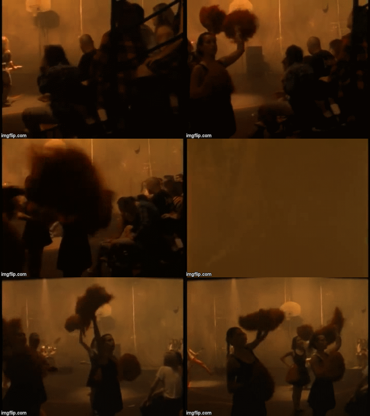
- Nirvana's music video has a lot of straight cuts and camera pans throughout, the camera pans and straight cuts are present clearly when the tone of the music changes. You can see this at the start when the music and beat is slower the video has straight cuts but most of the shots in-between have camera pans as the music is slower and smoother and is reflected through the pans, however in the chorus the beat starts to get faster and the camera stops panning and starts to do just straight cuts as the beat is faster and therefore "jumpier" and is reflected by the straight cuts. Goodwin's theory states that the beat of the music can influence the music video and that is seen quite clearly here.
Sound:
- The beat of the song changes throughout the video as it starts off smooth and when the chorus kicks in at 'With the lights out, it's less dangerous' the beat starts to get faster and inturn the actions in the video start to become more frantic along with the camera shots. The lyrics and the tone of the song get reflected well in the layout of the set as it is very dark and creates a negative atmosphere. This can be proven through Goodwin's theory that the actions in the music video match the lyrics or sound either in tone or in what the words are trying to say, you can see that is present here as the lyrics and beat of the music clearly powerfully dictate the music video.
Mise-en-scene:
- The costumes worn by the band and the audience in the stands are mostly dark colour which reflects the emotion the song releases as it creates a dark and gloomy effect, this complements the lighting in the shots as well. The main props throughout the video are the bands instruments, this is common for a band of their genre (rock) as this is the common theme across most rock bands music videos for example in Muse's video Uprising.

Editing:
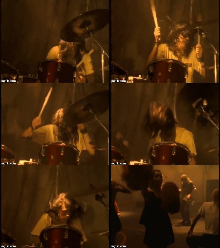
-For this video to match the darkness of the props and setting of the video they added a brown tint to the video to make the video seem like they were in a dingey and dusky building, this effect gives the video connotations that the band playing there should not be there as if it is an abandoned building. They also used a slow motion effect when the drummer flicks his hair up and down when playing the drums at 1:09, this is to put an emphasis on the drummer and the passion that he puts into playing his music and this is 'head banging' which is a dance move of this genre of music.
Thursday, 14 July 2016
Task 9 - Analysis of a digipak (Foo Fighters)
The front:
The front of the digipak shows all the band members twice from different angles and a range of colours in a pattern over their faces, this makes them stand out from the solid black background and the fontis bright red which matches the colour pattern on the bands faces as well as standing out from the dark backgorund. The whole front cover is very minimalistic which could reflect the personality of the band which is very simplistic without entering the hollywood fame and keeping themselves in the media all the time like other bands.

The back cover:
The back cover of the digipak has an artistic abstract pattern to the back and includes some of the colours on the pattern of the front cover to continue the pattern and artistic feel of the album covers. The font of the track names are in white with some bits of yellow in which makes these bright colours stand out from the dark red and black background that they are placed upon, they are also in an absract pattern like the front of the digipak as the words have yellow triangles that connect to each other.

The CD design:
The CD has a dark background and the absract yellow and grey patterns on the front can create different images for the audiences to see as they can be interpreted in many different ways. The yellow and grey colours coninue onto the font to make it stand out against the dull dark balck background, the font colours allow it to merge in with the background and could signify that the band isn't important and that they should be known for their art.

The front of the digipak shows all the band members twice from different angles and a range of colours in a pattern over their faces, this makes them stand out from the solid black background and the fontis bright red which matches the colour pattern on the bands faces as well as standing out from the dark backgorund. The whole front cover is very minimalistic which could reflect the personality of the band which is very simplistic without entering the hollywood fame and keeping themselves in the media all the time like other bands.
The back cover:
The back cover of the digipak has an artistic abstract pattern to the back and includes some of the colours on the pattern of the front cover to continue the pattern and artistic feel of the album covers. The font of the track names are in white with some bits of yellow in which makes these bright colours stand out from the dark red and black background that they are placed upon, they are also in an absract pattern like the front of the digipak as the words have yellow triangles that connect to each other.
The CD design:
The CD has a dark background and the absract yellow and grey patterns on the front can create different images for the audiences to see as they can be interpreted in many different ways. The yellow and grey colours coninue onto the font to make it stand out against the dull dark balck background, the font colours allow it to merge in with the background and could signify that the band isn't important and that they should be known for their art.

Task 9 - Analysis of a digipak (Nirvana)
The front:
The front cover is very different to most album covers out there as it is a image that audiences were shocked by and some did not like it at all, however this album cover made the album very memorable and caused Nirvana's fame to take off as the album was so successful. The image can be interpreted in many different ways, I believe that Nirvana were trying to show that there was a lot of greed in the world as the image represents something so innocent and pure can be tainted by greed so easily if it is there on a hook.

The back cover:
The back cover continues the water-like theme as if you are looking at the effect of the sun through the water on the bottom of a swimming pool, this allows the font for the song names to stand out on the right side of the back cover as they are black and in the Nirvana style font. The same strange pictures continue onto the back also with the monkey in a dark red fiery background, this is probably to draw audience's attention tot he back as without it the back would be pretty dull in colour.

CD design:
The CD desgn carries on the water theme as it has lots of turquoise lines going over it giving it a wavey design, the font on the CD also gives it a wave feel to continue the water theme throughout. The font is a bold black and the band name is in the classic Nirvana font, this makes the Band name and the album name stand out from the simple coloured background as the colours are not as promenatent as the black writing.

The front cover is very different to most album covers out there as it is a image that audiences were shocked by and some did not like it at all, however this album cover made the album very memorable and caused Nirvana's fame to take off as the album was so successful. The image can be interpreted in many different ways, I believe that Nirvana were trying to show that there was a lot of greed in the world as the image represents something so innocent and pure can be tainted by greed so easily if it is there on a hook.
The back cover:
The back cover continues the water-like theme as if you are looking at the effect of the sun through the water on the bottom of a swimming pool, this allows the font for the song names to stand out on the right side of the back cover as they are black and in the Nirvana style font. The same strange pictures continue onto the back also with the monkey in a dark red fiery background, this is probably to draw audience's attention tot he back as without it the back would be pretty dull in colour.

CD design:
The CD desgn carries on the water theme as it has lots of turquoise lines going over it giving it a wavey design, the font on the CD also gives it a wave feel to continue the water theme throughout. The font is a bold black and the band name is in the classic Nirvana font, this makes the Band name and the album name stand out from the simple coloured background as the colours are not as promenatent as the black writing.

Tuesday, 12 July 2016
Research into a record label
The Warner Bros. Record label was started in 1958 as a subsidiary from the main parent comany Warner Bros and the chairman/CEO is Cameron Strang. The record label has around 113 artists spanning across many different genres from pop (Jason Derulo) to indie rock (Red Hot Chili Peppers).


Friday, 8 July 2016
Prelim - Photography task


- Program settings ^^ (top to bottom): -4, -2, 0, 3.
- Aperture settings (below) (top to bottom): f/2.8.


- Shutter speed (below): 1/6400.


Friday, 1 July 2016
Task A - Brainstorming ideas
David and I started to brainstorm some ideas, we haven't got that many or started our storyboard but we had loads of ideas for the video and needed to discuss and write them down. These are the notes that we wrote down and the picture that Mrs took of us when we were brainstorming to provide proof:


Subscribe to:
Posts (Atom)