Showing posts with label Research. Show all posts
Showing posts with label Research. Show all posts
Monday, 19 September 2016

Tuesday, 19 July 2016
Task 12 - Target Audience for Indie Rock (secondary)
Below is an embeded piece from https://infogr.am/Target-audience-research-analysis, here the relevant information that I need for my research is that the main target audience is around 16-25 years old students from the London area and dominated by white males at 68%.
Friday, 15 July 2016
Task 8 - Analysis of a music video (Arctic Monkeys)
This is their music video as I couldn't put it into the SlideShare as PowerPoint wouldn't allow me to:
Task 8 - Analysis of a music video (Nirvana)
The video that I am analysing is Nirvana's song Smells Like Teen Spirit, this is the music video for it:
Camera:
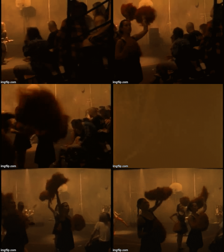
- Nirvana's music video has a lot of straight cuts and camera pans throughout, the camera pans and straight cuts are present clearly when the tone of the music changes. You can see this at the start when the music and beat is slower the video has straight cuts but most of the shots in-between have camera pans as the music is slower and smoother and is reflected through the pans, however in the chorus the beat starts to get faster and the camera stops panning and starts to do just straight cuts as the beat is faster and therefore "jumpier" and is reflected by the straight cuts. Goodwin's theory states that the beat of the music can influence the music video and that is seen quite clearly here.
Sound:
- The beat of the song changes throughout the video as it starts off smooth and when the chorus kicks in at 'With the lights out, it's less dangerous' the beat starts to get faster and inturn the actions in the video start to become more frantic along with the camera shots. The lyrics and the tone of the song get reflected well in the layout of the set as it is very dark and creates a negative atmosphere. This can be proven through Goodwin's theory that the actions in the music video match the lyrics or sound either in tone or in what the words are trying to say, you can see that is present here as the lyrics and beat of the music clearly powerfully dictate the music video.
Mise-en-scene:
- The costumes worn by the band and the audience in the stands are mostly dark colour which reflects the emotion the song releases as it creates a dark and gloomy effect, this complements the lighting in the shots as well. The main props throughout the video are the bands instruments, this is common for a band of their genre (rock) as this is the common theme across most rock bands music videos for example in Muse's video Uprising.

Editing:
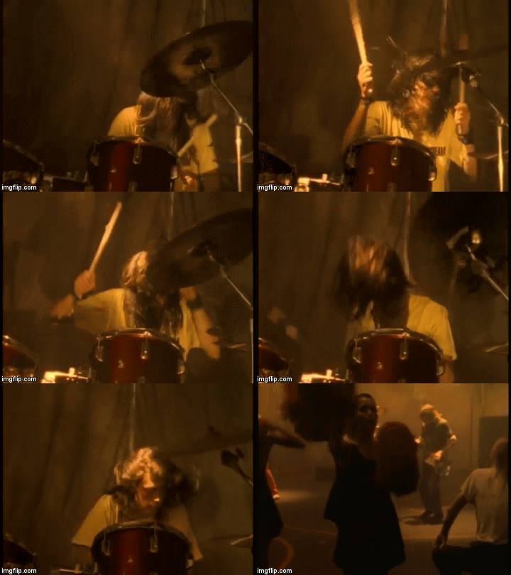
-For this video to match the darkness of the props and setting of the video they added a brown tint to the video to make the video seem like they were in a dingey and dusky building, this effect gives the video connotations that the band playing there should not be there as if it is an abandoned building. They also used a slow motion effect when the drummer flicks his hair up and down when playing the drums at 1:09, this is to put an emphasis on the drummer and the passion that he puts into playing his music and this is 'head banging' which is a dance move of this genre of music.
Thursday, 14 July 2016
Task 9 - Analysis of a digipak (Foo Fighters)
The front:
The front of the digipak shows all the band members twice from different angles and a range of colours in a pattern over their faces, this makes them stand out from the solid black background and the fontis bright red which matches the colour pattern on the bands faces as well as standing out from the dark backgorund. The whole front cover is very minimalistic which could reflect the personality of the band which is very simplistic without entering the hollywood fame and keeping themselves in the media all the time like other bands.

The back cover:
The back cover of the digipak has an artistic abstract pattern to the back and includes some of the colours on the pattern of the front cover to continue the pattern and artistic feel of the album covers. The font of the track names are in white with some bits of yellow in which makes these bright colours stand out from the dark red and black background that they are placed upon, they are also in an absract pattern like the front of the digipak as the words have yellow triangles that connect to each other.

The CD design:
The CD has a dark background and the absract yellow and grey patterns on the front can create different images for the audiences to see as they can be interpreted in many different ways. The yellow and grey colours coninue onto the font to make it stand out against the dull dark balck background, the font colours allow it to merge in with the background and could signify that the band isn't important and that they should be known for their art.

The front of the digipak shows all the band members twice from different angles and a range of colours in a pattern over their faces, this makes them stand out from the solid black background and the fontis bright red which matches the colour pattern on the bands faces as well as standing out from the dark backgorund. The whole front cover is very minimalistic which could reflect the personality of the band which is very simplistic without entering the hollywood fame and keeping themselves in the media all the time like other bands.
The back cover:
The back cover of the digipak has an artistic abstract pattern to the back and includes some of the colours on the pattern of the front cover to continue the pattern and artistic feel of the album covers. The font of the track names are in white with some bits of yellow in which makes these bright colours stand out from the dark red and black background that they are placed upon, they are also in an absract pattern like the front of the digipak as the words have yellow triangles that connect to each other.
The CD design:
The CD has a dark background and the absract yellow and grey patterns on the front can create different images for the audiences to see as they can be interpreted in many different ways. The yellow and grey colours coninue onto the font to make it stand out against the dull dark balck background, the font colours allow it to merge in with the background and could signify that the band isn't important and that they should be known for their art.

Task 9 - Analysis of a digipak (Nirvana)
The front:
The front cover is very different to most album covers out there as it is a image that audiences were shocked by and some did not like it at all, however this album cover made the album very memorable and caused Nirvana's fame to take off as the album was so successful. The image can be interpreted in many different ways, I believe that Nirvana were trying to show that there was a lot of greed in the world as the image represents something so innocent and pure can be tainted by greed so easily if it is there on a hook.

The back cover:
The back cover continues the water-like theme as if you are looking at the effect of the sun through the water on the bottom of a swimming pool, this allows the font for the song names to stand out on the right side of the back cover as they are black and in the Nirvana style font. The same strange pictures continue onto the back also with the monkey in a dark red fiery background, this is probably to draw audience's attention tot he back as without it the back would be pretty dull in colour.

CD design:
The CD desgn carries on the water theme as it has lots of turquoise lines going over it giving it a wavey design, the font on the CD also gives it a wave feel to continue the water theme throughout. The font is a bold black and the band name is in the classic Nirvana font, this makes the Band name and the album name stand out from the simple coloured background as the colours are not as promenatent as the black writing.

The front cover is very different to most album covers out there as it is a image that audiences were shocked by and some did not like it at all, however this album cover made the album very memorable and caused Nirvana's fame to take off as the album was so successful. The image can be interpreted in many different ways, I believe that Nirvana were trying to show that there was a lot of greed in the world as the image represents something so innocent and pure can be tainted by greed so easily if it is there on a hook.
The back cover:
The back cover continues the water-like theme as if you are looking at the effect of the sun through the water on the bottom of a swimming pool, this allows the font for the song names to stand out on the right side of the back cover as they are black and in the Nirvana style font. The same strange pictures continue onto the back also with the monkey in a dark red fiery background, this is probably to draw audience's attention tot he back as without it the back would be pretty dull in colour.

CD design:
The CD desgn carries on the water theme as it has lots of turquoise lines going over it giving it a wavey design, the font on the CD also gives it a wave feel to continue the water theme throughout. The font is a bold black and the band name is in the classic Nirvana font, this makes the Band name and the album name stand out from the simple coloured background as the colours are not as promenatent as the black writing.

Tuesday, 12 July 2016

Research into a record label
The Warner Bros. Record label was started in 1958 as a subsidiary from the main parent comany Warner Bros and the chairman/CEO is Cameron Strang. The record label has around 113 artists spanning across many different genres from pop (Jason Derulo) to indie rock (Red Hot Chili Peppers).


Friday, 8 July 2016
Prelim - Photography task


- Program settings ^^ (top to bottom): -4, -2, 0, 3.
- Aperture settings (below) (top to bottom): f/2.8.


- Shutter speed (below): 1/6400.


Friday, 1 July 2016
Task 2 - Others work part two
Research:
In Rory Ford's research he was very detailed and explained his work very well so it was easily understandable and provided a lot of evidence through pictures and YouTube videos. However he could have used other mediums to display his evidence or his work for example through SlideShare or through GIFs just to make it more interesting.
Planning:
In his research he did adequate research to start on his music video and got the letter of premission from Warner, however it lacked detail and intense preparation which I feel this task needs and he also didn't use many mediums to display his work.

Music Video:
He captured the dark and casual theme of the indie rock genre in the video. However the video didn't look very professional as the shots were very shakey, the lighting showed the shadow of the camera man on the walls and some of the actions the actors were doing were ridiculous as they didnt fit what the music was playing. For example when one of the actors is rolling on the floor playing the guitar the music is slow and doesn't have a guitar solo or anything that would mean he would be doing that.
Digipak:
The strengths of his digipak were that his front cover photo was amazing as it was a really hard shot to take of the insect, it made it look very professional and made it unique to the others that I have seen. However the weakness was that the pictures near the end were a bit plain and the font on the back didn't match the front and the overall theme of the digipak.

Magazine advert:
The strengths of his magazine advert were that it shows the band to people so they know who they are and the font really stands out at the top. The weakenesses are that it is very plain and the website name at the bottom had a weird grey background that didnt really fit the magazine advert and drew my attention to that rather than the advert itself.

Evaluation:
His evaluation was very different to the rest of his work as he had included lots of detail in each section and actually used different mediums to display his work however the only thing that I could point out as a flaw in his evaluation was that he had a few posts that were just text only and he could have included some pictures in them.


In Rory Ford's research he was very detailed and explained his work very well so it was easily understandable and provided a lot of evidence through pictures and YouTube videos. However he could have used other mediums to display his evidence or his work for example through SlideShare or through GIFs just to make it more interesting.
Planning:
In his research he did adequate research to start on his music video and got the letter of premission from Warner, however it lacked detail and intense preparation which I feel this task needs and he also didn't use many mediums to display his work.

Music Video:
He captured the dark and casual theme of the indie rock genre in the video. However the video didn't look very professional as the shots were very shakey, the lighting showed the shadow of the camera man on the walls and some of the actions the actors were doing were ridiculous as they didnt fit what the music was playing. For example when one of the actors is rolling on the floor playing the guitar the music is slow and doesn't have a guitar solo or anything that would mean he would be doing that.
Digipak:
The strengths of his digipak were that his front cover photo was amazing as it was a really hard shot to take of the insect, it made it look very professional and made it unique to the others that I have seen. However the weakness was that the pictures near the end were a bit plain and the font on the back didn't match the front and the overall theme of the digipak.

Magazine advert:
The strengths of his magazine advert were that it shows the band to people so they know who they are and the font really stands out at the top. The weakenesses are that it is very plain and the website name at the bottom had a weird grey background that didnt really fit the magazine advert and drew my attention to that rather than the advert itself.

Evaluation:
His evaluation was very different to the rest of his work as he had included lots of detail in each section and actually used different mediums to display his work however the only thing that I could point out as a flaw in his evaluation was that he had a few posts that were just text only and he could have included some pictures in them.


Wednesday, 29 June 2016
Prelim task - Evaluation
Overall I thought our music video was good but it definitely could have been better as some of the shots were very shaky or they were not completely the same as the real video. However despite those flaws we followed the story of the music video and what events happened in the video, If we had the right equipment and more time to prepare and film then we might have gotten a better result and finished product at the end.
Some problems that we encountered when doing this process was trying to get the scenes matched up perfectly with the original, even though this will not be a problem for my final product as it is a music video of my own creation I could have rectified it by having the original video in the bottom corner from the start as I did not when I first started putting the clips together. We also did not have enough props and costume when doing the filming due to lack of time to do it, this means that in my music video I will make it a key point to make sure that props and costumes are properly researched and used in my video to make it more professional.
Evaluating the process.
I feel that the process was very useful as it really showed me how hard it is to make a music video and make sure that it matches the track that we would be using, without this I think everyone would have struggled to adapt and learn from their mistakes that they made this time round for their finished product. From this process I have learnt how important it will be to plan thoroughly for our final product and to make sure that all my shots are watched back thoroughly to make sure that they are the best that they can be and to the standard that I had on my storyboard/plan/head.Some problems that we encountered when doing this process was trying to get the scenes matched up perfectly with the original, even though this will not be a problem for my final product as it is a music video of my own creation I could have rectified it by having the original video in the bottom corner from the start as I did not when I first started putting the clips together. We also did not have enough props and costume when doing the filming due to lack of time to do it, this means that in my music video I will make it a key point to make sure that props and costumes are properly researched and used in my video to make it more professional.
Task 3 - Marketing packet research: Digipak


On the back of the digipak it lists all of the tracks on the album, it has very simple and small font to display the tracks. However this type of font might not draw the customers eye but they focus mainly on the background art where it shows the band by a lake much like the front cover however they look more like silhouettes than people. This background is what the album relies on to make the customer look closer at the back, it also reflects the laid back characteristics of an indie rock artist/band.

The gatefold/book style paperboard inside the album is very different to the front of the digipak and the look of the CD, inside it contains the words to the songs featured on the CD and the background to them are very colourful and each has a different theme which links to the song or creates a feel as to what the emotion in the song that is conveyed. As you can see from the pictures down below they are very different to the other pictures of the digipak that I have shown, this helps show a different side to the artists that you can only see if you buy the album therefore connecting with their most loyal fans.


The CD inside the Minutes to Midnight album is very simplistic, it shows the main band logo and name in dark colours which really stand out on the CD. It also has the track names and their numbers on the outer rim of the CD which add to the design of the CD. The simplistic design of the CD represents the laid back and relaxed nature of the band and the genre.

For the Minutes to Midnight album they also made a poster to go with it, the poster followed the same theme as the outside of the album where the background was entirely black and white with simplistic font to go on it. However as it is a poster which is designed to attract customers to buy the album they had made the band name very big and a unique font to make it stand out, also they put their logo in the middle of the poster and made it big and red which makes it stand out on the poster consequently makes the poster more eye catching due to the contrast in colours. Here is the poster:

Subscribe to:
Posts (Atom)